A new destination for stippl.
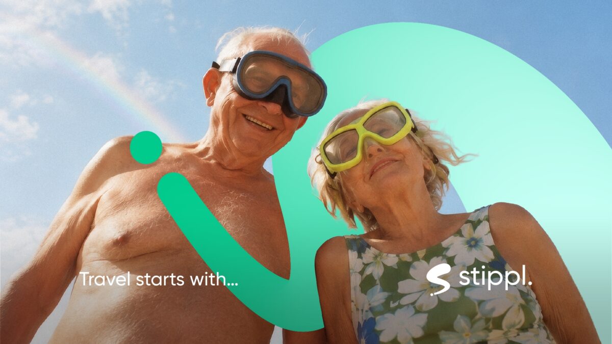
Travel starts with stippl.
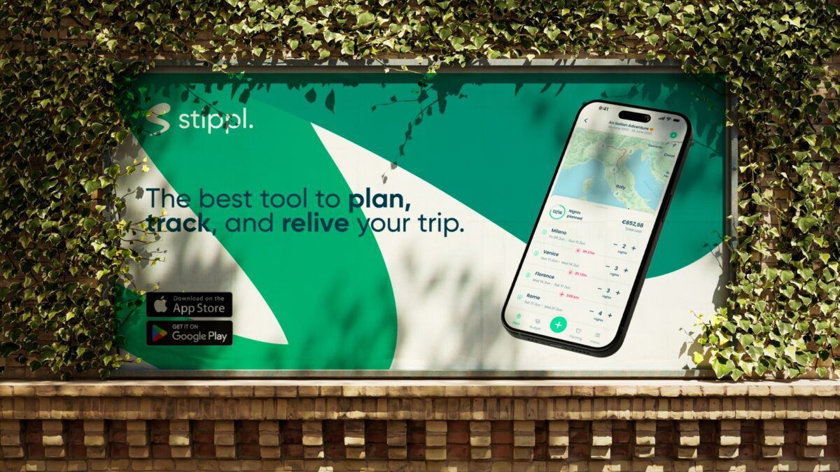
The world is a pretty big place. And with only so many holidays in a year, choosing where to go can feel like a trip in itself. Stippl makes that easier by bringing inspiration and planning together in one travel platform, helping you go from “where should we go?” to a trip you’re actually excited about.
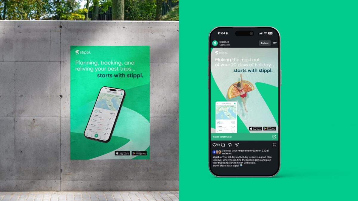
We repositioned and redesigned the brand around one simple thought: Travel starts with Stippl. A promise that puts Stippl at the beginning of the journey, helping travellers make the most of their time away.
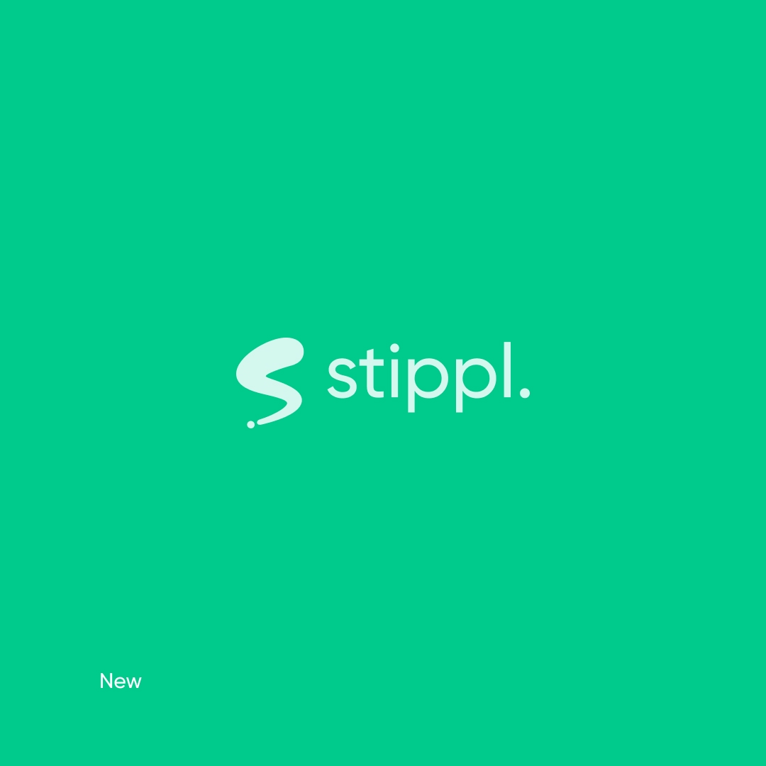
Stippl already had a friendly and accessible identity, with the idea of plotting a journey hidden inside its logo. We kept that thought, but gave it more movement and character. The new identity is built around a dynamic symbol inspired by direction, routes and the ‘S’ of Stippl, creating a visual language that naturally moves through the brand.
The result feels less like a travel tool and more like travel itself: spontaneous, energetic and always going somewhere.
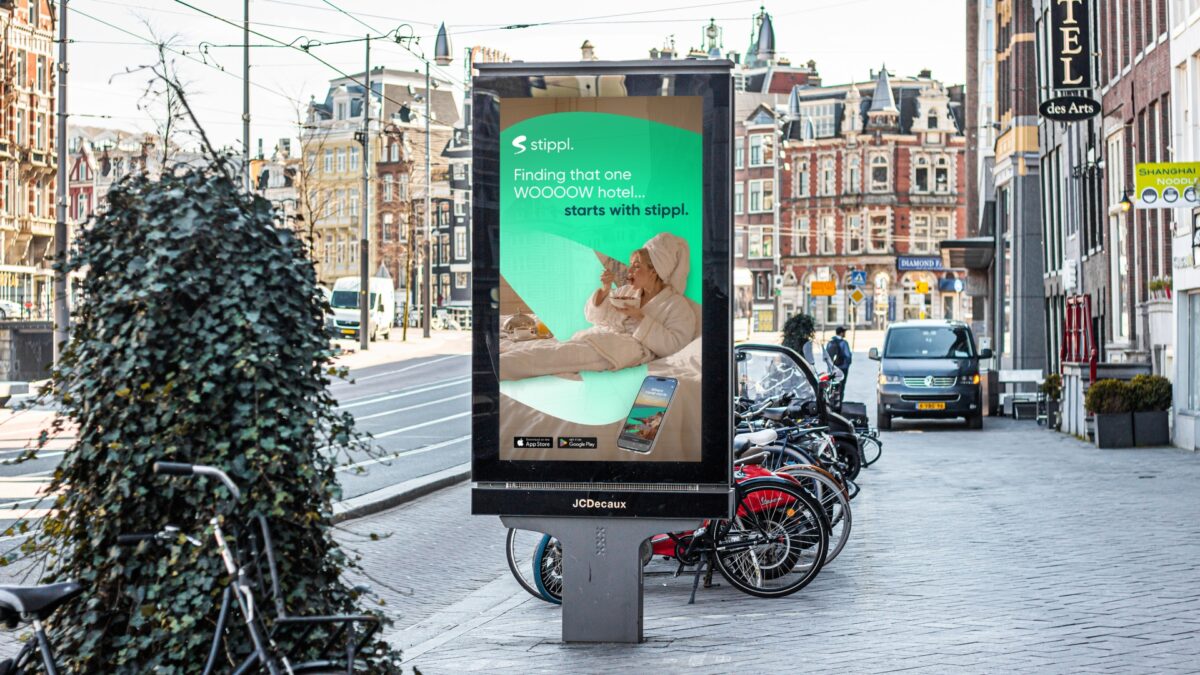
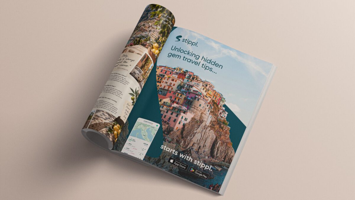
The positioning became more than a tagline. It gave Stippl a simple and flexible way to communicate everything that makes travelling worth it. Making new friends, finding that WOOOOOW hotel, discovering a hidden gem or getting the most out of your days away can all end in the same place: …starts with Stippl.
This creates a recognisable thread across the brand, while leaving plenty of room to talk about different destinations, experiences and features.
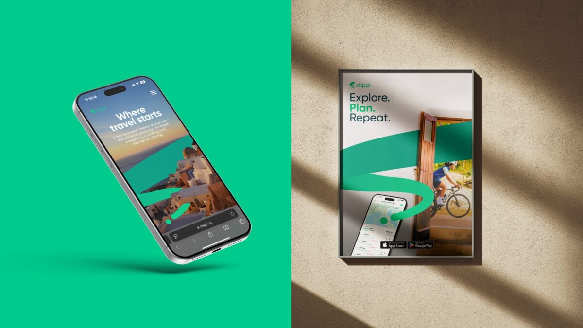
The new stippl.io brings the brand into the experience. Instead of opening the site with a destination already in mind, travellers can start by exploring places and discovering trips worth taking. Destination guides bring together what to see, where to stay, when to go and useful local tips, while trip suggestions offer a practical starting point for building your own journey.
It turns Stippl into a place to start exploring before you know exactly where you’re going, and then take that inspiration with you as it becomes a real trip.